
Color accuracy is of the most importance in art documentation, especially when it comes to paintings. I want blog here about my color management workflow and tools.
Here is a video of the color management workflow processes I describe below.
Step 1. Camera Calibration. Due to differences in technologies and variables in manufacturing processes every camera captures colors a bit differently. Even two identical cameras from the same company are a bit different. Even if the Raw processing software you are using could have included a profile for the model camera which you use, you can get even better results when you create a profile specifically for the RAW output of your camera.
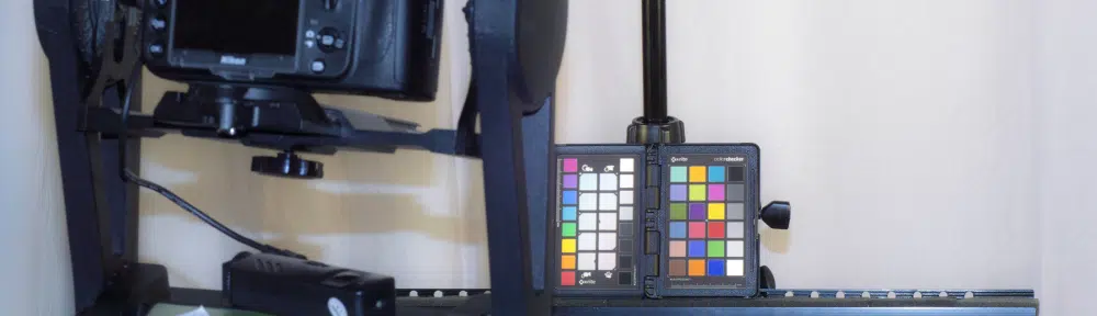
To calibrate my Nikon D800 I use X-rite ColorChecker Passport and its bundled software. ColorChecker Passport Classic Target is the industry standard color reference target for creating DNG profiles and for evaluating specific colors.
X-rite ColorChecker Passport being photographed to calibrate my Nikon D800.
Here the sequence of instructions to calibrate your camera. More exact instructions are provided by the manufacturer here.
- Take a RAW picture of the X-rite classic 24 patches target.
- Save the picture in DNG format.
- Open ColorChecker Passport software included with X-rite ColorChecker Passport.
- Drag and drop the DNG image in the software main windows and click “create profile.”
- save the new DCP file in the Camera Raw folder (in Win7 C:UsersuserAppDataRoamingAdobeCameraRawCameraProfiles)
- When you turn on Camera Raw you will see the new profile in the camera calibration tab.
As an example compare the picture of the ColorChecker with the custom Nikon D800 camera calibration and the Adobe Default camera calibration.
ColorChecker Passport Nikon D800 Custom Calibration
ColorChecker Passport Adobe Default Camera Calibration.
Step 2. White Balance. X-Rite ColorChecker Passport has a grey target for White Balance so you can create custom in-camera white balance for a consistent white point in a set of images, eliminating the need to correct each image later. White balance is different from the camera calibration seen in the step above, The first one correct for different lighting while the second one correct for different rendering of colors by different cameras.
By the way, for outdoor photography I use expodisk. This expodisc is calibrated for 18% light transmission and neutrality in the visible spectrum (400nm to 700nm) and it is used as an incident ambient exposure tool (as you would with an 18% gray card), as well as for white balance. It comes handy in all those outdoor photography sections where you do not want to risk damaging your color checker target.
Expodisk is a valid tool for fast white balancing in those rough situations such as outdoor photography.
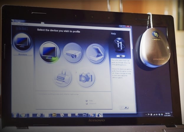
Step 3. Monitor calibration. For last photo-editing on your images or just to be sure your images look fine you must calibrate your monitor. Monitor calibration is recommended every month or earlier. I use X-rite i1 Display and its i1 Match 3 software to calibrate my laptop monitor.
AIC Photo Documentation Target. Once the color management workflow is set up, I document art with the AIC Photo Documentation Target in order to always have color checker reference in the actual images. This target has also some more features such as an illumination guide associated with a parallelism indicator, a size scale, and an area for date and object identification information. I added to it a cadmium red and forensic UV swatch which I use respectively to calibrate Infrared fluorescence and UV fluorescence.
AIC Photo Documentation Target


I love AIC but I alwayd found their chart too overpriced. They don’t resolve the problem of the lack of color charts and their high value, that pushes a lot of us to make our own color charts, even in photographic prints, with the logic risk of missleading tones and the issue of discolouration. What do you think on that?
Hi Rez, I do agree they are actually expensive. I bought mine in US, are you in Europe? There would probably be still more expensive, I guess. Though, strictly talking about the conservation field it is strictly recommended to have a standard colorchecker, so this is why I adopted the AIC, though, of course there are many others on the market, much less expensive. It is important when documenting art to have have images that anybody can interpret and understanding and this is possible if a widely-recognized colorchecker is used.
Also I can’t decide which one to buy: X-Rite ColorChecker Passport or Expodisc.
I want to use it for indoor and outdoor shots with flash. I don’t want to use color gels.
Any suggestions?
Hi, they are very different tools. Expodisc is for outdoor photography
hello there. i own the x-rite passport color checker. i have tried to create a profile with ultraviolet light to document uv efflorescence on paintings, but, sadly, i did not manage as the software complained that the light source is not supported. contacted the company but did not even get a reply. i need to get the true colours of paintings in uv as i cant stand getting over-bluish hues on my pictures. can you please provide a simple guideline to achieve this profile? many thanks!!
Hi David,
There is not a recognized and official way to calibrate UV Fluorescence photo. It is still an open problem. I have my own method, which I submitted with a publication still under review. I’ll give notice of its publication on the blog when it gets published. Anyway, I use the X-rite passport just for the calibration of the camera. Then, there is no need to recalibrate the camera for the UVF since you are photographing visible light. What I did is to add fluorescent targets to my color checker and to edit my UVF images in camera raw using a set for the temperature and tint which is constant with the lamp I use (Xenopus LED 365). If you use a different UV lamp you would have different visible contribution for the lamp and this will affect your image differently.
Hello Antonio and thank You for sharing the knowledge! I am wondering, would X-Rite ColorChecker Classic Mini replace the AIC Photo Documentation Target in the photo documentation? Or is there some problem that I don’t see here, except the special layout of the AIC? As I have neither of them yet, I would choose just the X-Rite for the whole process.
Thank You!
Antti
Hi Antti, sure you can use the X-Rite to make white color balance. The main issue against this is the form factor. X-Rite is quite a big chart, since it is designed for other purpose than white balance calib of the photo scenes.
Thank You! Yet there is some understanding that I’m missing in the process: if ColorChecker needs at least 24 tones (with Colorchecker SG the number is 140) to match the colors between the real scene and the image, then how can later the only 12-field RMI PhD Target help anyone to get back from reproduced image to the (closer) colors of the original work?
With best,
Antti